How Does the Psychology of Color Influence Emotions & Perception?
- November 6, 2025
- 0
Have you ever wondered why a red stop sign immediately catches your eye, or why hospitals are often painted in cool blues and greens? The answer to this
Have you ever wondered why a red stop sign immediately catches your eye, or why hospitals are often painted in cool blues and greens? The answer to this
Have you ever wondered why a red stop sign immediately catches your eye, or why hospitals are often painted in cool blues and greens? The answer to this is presented in the fascinating science of color psychology. Color can change our moods, choices and even behaviors far more than it is merely a decorative factor. The strategic use of color as a tool of communication and influence is not a recent discovery among artists, designers, marketers and psychologists.
This guide will answer the question of how colors affect human psychology, the science and cultural insights of how people perceive color, and the way to use the psychology of color in your own creative work or business. At the end, it will not only be possible to notice the impact of color everywhere but also to use it with new degrees of mastery.
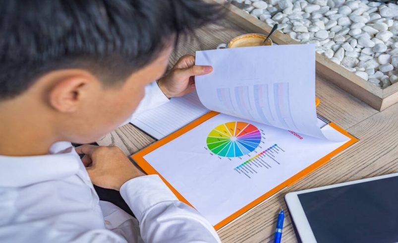
The psychology of colors examines the effect of the hues on the behavior, thoughts, and sentiments of human beings. It takes into account the biological reactions, cultural implications and individual experiences to find out why some colors evoke certain emotions.
Light reflects off or is absorbed by an object according to the wavelengths, and our eyes perceive the colors. This is transmitted to the brain, which in turn causes cognitive recognition (that is blue) and emotional or physiological reactions (calm, alert, hungry, etc.).
Though responses to color can be subjective, years of research and cross-cultural studies have identified common emotional reactions. Here are the most influential colors and their typical associations:
| Color | Typical Emotions/Associations | Common Uses |
| Red | Passion, excitement, urgency, aggression, love | Sales, warnings, fast food, romance |
| Orange | Enthusiasm, warmth, energy, creativity | Calls-to-action, children’s brands |
| Yellow | Happiness, optimism, friendliness, caution | Sale tags, food brands, taxis |
| Green | Health, tranquility, nature, growth, wealth | Environmental orgs, finance, health |
| Blue | Calmness, trust, security, stability | Tech brands, corporate, health care |
| Purple | Luxury, mystery, spirituality, creativity | Beauty, luxury, chocolate |
| Pink | Youth, fun, compassion, romance | Fashion, toys, beauty |
| Brown | Reliability, comfort, earthiness, simplicity | Coffee, organic brands |
| Black | Power, elegance, sophistication, mystery | Luxury goods, fashion, tech |
| White | Purity, clarity, freshness, simplicity | Health care, tech, bridal |
Remember: Colors, hues, and patterns may alter the meaning. A low-key pink is motherly; a neon pink is vigorous. Dark blue could be associated with formality, whereas sky blue is less formal.
Color meanings are shaped by culture, history, and context. Here’s how some colors differ around the world:
Takeaway: You should always research the audience when deciding to use a particular color in international products, brands or art.
Color is a storyteller and the perception of a brand that creates customers. Take into account the mood that Coca-Cola red creates, and makes enthusiastic and vital, or the mood that Facebook blue creates, and makes reliable and trustworthy.
The colors are chosen carefully by the artists to establish mood, depth, and to pass on themes. Soft pastels were employed by Impressionists such as Monet in tranquility and bold primaries were employed by Expressionists such as Munch to convey an emotional effect.
Colors physiologically cause the following reactions:
Color therapy studies have demonstrated that one can affect how one feels by being placed in an environment of specific colors- an ancient practice such as Feng Shui and holistic medicine.
Case 1: McDonald’s
Red and yellow, their primary colors, are proven to stimulate appetite and energy, attracting customers in a fast-paced environment.
Case 2: Calm App
Soft blues and greens dominate, instantly signaling peace and mindfulness.
Case 3: Netflix
The black and red scheme creates drama and excitement, fitting for entertainment and binge-worthy content.
While plenty of evidence exists supporting color’s influence, it’s rarely absolute. Environmental factors, language, and individual psychology modulate effects.
Psychology of color is a very subtle yet powerful force that forms emotions, behaviors, and decisions. Knowing the science, symbolism, and culture of color, you will be able to better your art, become a better brand and be able to relate better with your audience. Keep in mind: it is not about selecting your preferred shades only but about making meaningful and strategic experiences in color that make a first impression.
It is not something that you master in a day as far as color psychology is concerned. But you will find, with learning and practice, that all the colors in your palette are masterful instruments, they will stir the hearts, spur the fancies, and recount memorable experiences.