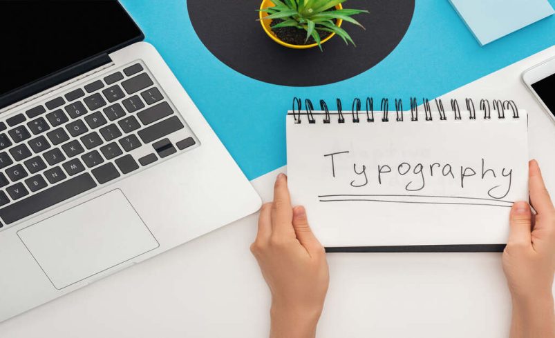
How Has Typography Evolved from Print to Digital Design?
- November 6, 2025
- 0
No matter what street you enter in the city, open a book, or scroll your phone, typography is everywhere. But ever have you been wondering how it all
No matter what street you enter in the city, open a book, or scroll your phone, typography is everywhere. But ever have you been wondering how it all
No matter what street you enter in the city, open a book, or scroll your phone, typography is everywhere. But ever have you been wondering how it all came to be the way the letters you read every day are? Typography is not just the art of organizing letters but a visual language, it is a part of history and it plays an important role in modern communication.
And we have much to learn regarding the exciting history of typography, where the earliest strokes of the brush have been blotted out to the online genius that we see today. You will learn on the way how typographic trends mirror societal changes, how fonts can be used to read between the lines, and will be advised on tips of tips to make typography work in the digital world.
The history of typography goes back centuries before the invention of the printing press. Hieroglyphs were carved out of stone by Egyptians. The Chinese painters came up with beautiful calligraphic characters. Monumental buildings were equipped with bold monolithic capitals by Romans.
Handwriting was not a matter of recording information alone, it represented status, power and identity. There was a blossom of manuscript traditions, each of which had its own scripts: consider the curling Irish insular scripts or straight and square lines of traditional Roman letters. All the scripts of any culture reflected its values and aesthetics.
The movable type press invented by Johannes Gutenberg in the 15th century is something that not only revolutionized typography but also the way the world gained access to knowledge.
Printed books enabled people to read as a mass. Initial type styles were much imitative of handwriting, they were forced to be, or they would not be relied upon by their audience! However, type could not merely imitate, it could define, and printers and designers soon found out that it could do so.
Typography had become an advanced art form by the 16 th and the 17 th centuries. Curiosity and innovation that were inspired by the Renaissance made designers experiment.
Such printers as Aldus Manutius and Claude Garamond created typefaces that had more curved lines and humanist proportions, which made reading a pleasure. The emphasis of the Enlightenment on clarity resulted in the design of harsh contrasted fonts, including Baskerville and Bodoni.
Typography had moods, serious, stylish, playful, or authoritative: any message could have a typography that was ready to match it.
Typography was being super-charged by the Industrial Revolution. Cities expanded, advertisement went to extremes, and print inundated open areas. Suddenly the type must vie with attention. Move into the period of audacious, experimentative display types, slab serifs, shadowed typings, even the extremist decoration.
The invention of such technologies as the Linotype machine increased the speed and accessibility of typesetting. Type houses were thriving; graphic design in the modern sense came into being. Typography was now a commercial and creative choice.
Although Victorian times were about ornamental bloom, the beginning of the 20th century era brought with it a wave of minimalism. The movement of modernist designers such as Bauhaus and Swiss design was against extravagance in design and embraced functionality.
Typeface legends emerged:
The fact of its timeless popularity says it all. The clarity, rhythm and balance they provided continue to be the basis of corporate logos, metro systems and international brands.
The digital age has transformed typography more than any other age. The revolution of desktop publishing software made access easier- anyone could now be a flyer or magazine designer and this was the best, with a wide range of fonts to use.
The True Type and Open Type formats rendered fonts scalable and screen friendly. The web presented its own difficulties: initially, websites had to use fonts that were web-safe, but with the development of CSS and the introduction of services such as Google Fonts, this is no longer a constraint. Brands now create their personal identities on the web using thousands of fonts that are optimized to work with all devices.
Nowadays, reading occurs everywhere on phones, smart watches and tablets. Responsive typography implies that type has to be attractive at all sizes. Variable fonts in which the designer can dynamically adjust the weight, width and slant of a single file are entered. It is lean and agile, a search engine victory on speed and availability.
Latin fonts are not the only thing that global brands can use. The modern typography needs to include Arabic, Chinese, Hindi, Cyrillic, and additional typography, each having their cultural and linguistic regulations.
Accessible type is not merely the best practice of design or law. It is about respecting your audiences: it should have a clear contrast, legible lines and enough spacing so that everyone can comfortably perceive your contents.
Typography influences brand, directs the eyes and influences trust more than you may think. It narrates, establishes moods and can make or break or break a digital product successful or not.
Are you willing to take your own usage of type to a higher level? Try these techniques:
Typography is much more than the appearance of letters on the screen of a computer or the paper of a page, it is the voice of all the messages, the soul of visual messages. Since the time of ancient carvings, the history of type flows through the history of human invention, innovation and self-expression.
In this day and age, the decisions you make with typography will determine how individuals perceive what they view, read and recollect. Be it crafting a brand, creating an email or creating a web page, a font is never neutral, it can be subtle, it can be bold, but it will always be powerful.
As you move forward, don’t just see typography as a design detail. See it as your opportunity to stand out, tell your story authentically, and connect with your audience at a deeper level. The evolution of typography isn’t over; it’s happening right now, every time you choose a font, adjust spacing, or hit “publish.”
Embrace the art and science of typography, and let it help you make your mark on the world.