Design Inspiration: Creative Ideas to Elevate Your Projects
- February 5, 2026
- 0
Every designer knows the specific kind of anxiety that comes from a blank screen. You sit down with your coffee, ready to work, but the white artboard just
Every designer knows the specific kind of anxiety that comes from a blank screen. You sit down with your coffee, ready to work, but the white artboard just
Every designer knows the specific kind of anxiety that comes from a blank screen. You sit down with your coffee, ready to work, but the white artboard just stares back at you. The cursor blinks rhythmically, almost as if it is mocking your lack of ideas. This “blank screen syndrome” is a universal struggle that hits everyone from junior associates to creative directors. It is not a sign that you lack talent; it is simply a sign that your creative well has run dry and needs refilling. You cannot draw water from an empty well, and you cannot output creativity without inputting fresh stimuli.
To fix this, we need to redefine what we mean by design inspiration. Many people mistake inspiration for copying, assuming that looking for ideas means finding a solution to duplicate. Real inspiration is much more active and transformative. It is about finding a spark—a color, a shape, a texture—that triggers a chain reaction in your brain. It is the shift from passively scrolling through social media feeds to actively hunting for the raw materials that will build your next masterpiece. When you learn to look at the world with the eyes of a scavenger, you realize that ideas are hiding in plain sight, waiting for you to find them.
Nature has been solving complex design problems for millions of years through the process of evolution. Every shape, pattern, and structure you see outside has survived because it is efficient and effective. When you are stuck on a layout or a logo, looking at the natural world can offer solutions that are both beautiful and functional. We are currently seeing a massive shift in design trends, moving away from the rigid, perfect grids of the early web toward fluid, organic shapes. These softer lines feel more human and approachable, helping to break down the barrier between the user and the screen.
One of the most fascinating tools nature gives us is the concept of fractals and the Golden Ratio. These are mathematical patterns that repeat infinitely and are found in everything from seashells to fern leaves. Using the Fibonacci sequence to guide your layout creates a sense of balance that feels “right” to the human eye, even if the viewer doesn’t understand why. It taps into a subconscious preference for natural order.
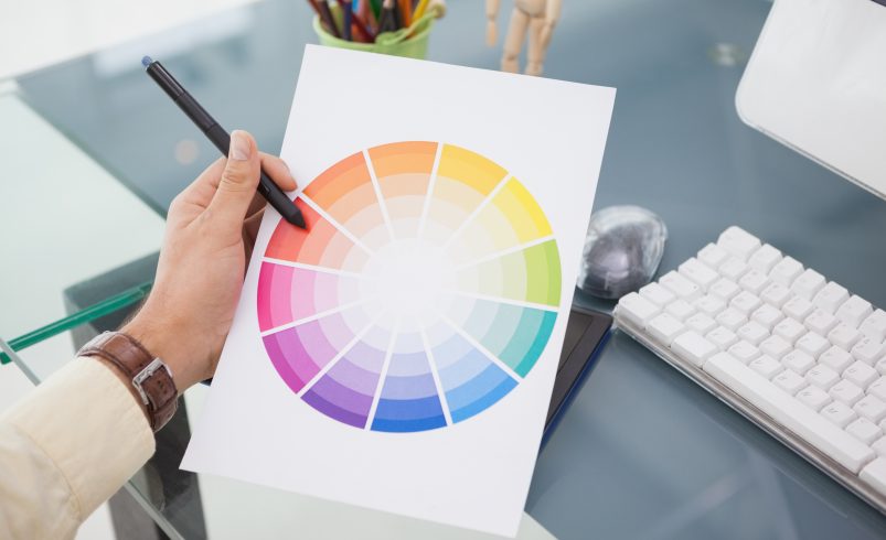
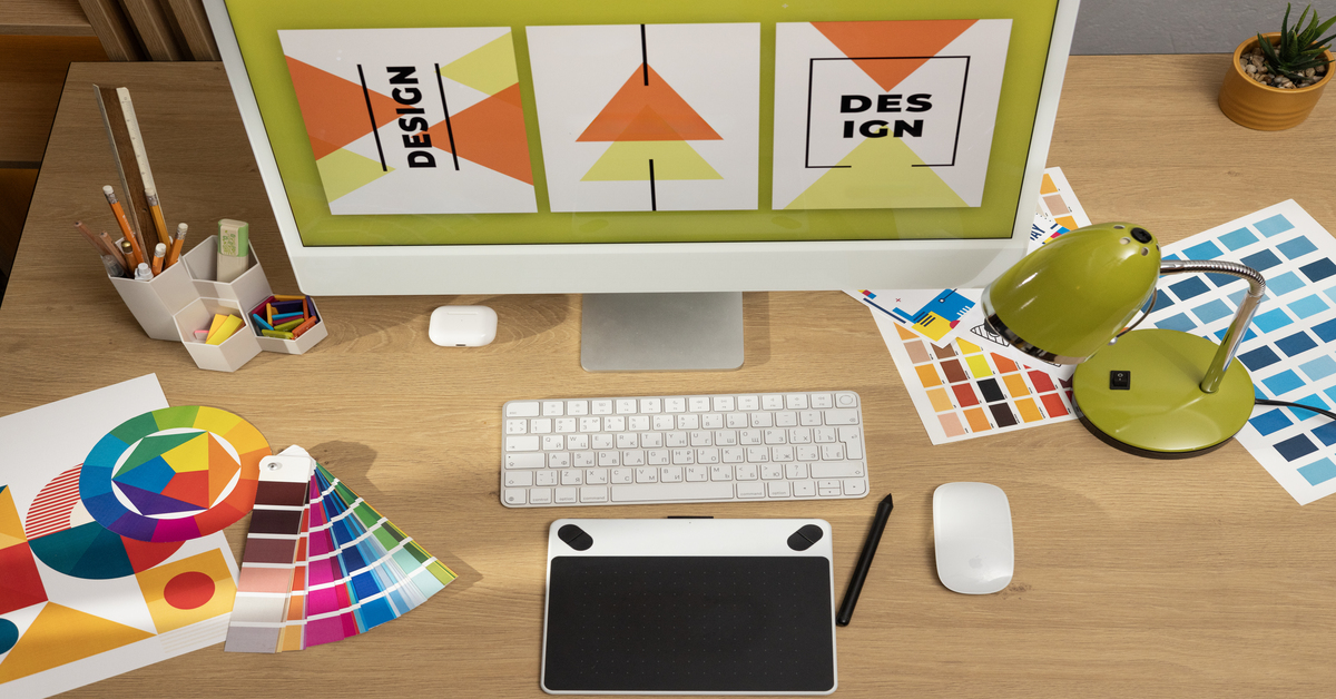
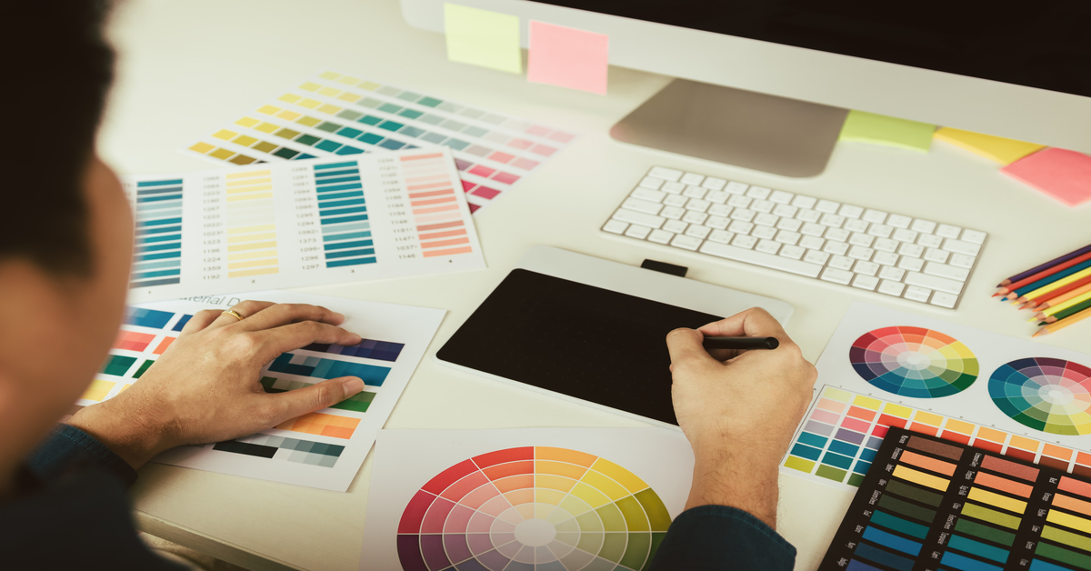
When choosing colors, it is easy to get stuck using the same digital color wheel or safe brand guidelines. Nature offers a more sophisticated approach through “atmospheric” palettes that capture a specific mood or moment in time. Think about the specific gray-blue of a street during a rainstorm, or the burnt orange and deep purple of a desert sunset. These aren’t just colors; they are feelings.
Applying these complex, earthy gradients to your work can evoke instant emotion in your user. A website for a meditation app might benefit from the calming, mossy greens of a forest floor rather than a clinical bright green. By sampling colors directly from photographs of nature, you introduce a level of nuance and harmony that is very difficult to achieve when manually picking hex codes. It grounds your design in reality, making it feel substantial and authentic.
There is a popular saying in the creative world that nothing is truly new; everything is a remix. This shouldn’t be discouraging; it should be liberating. Instead of looking at what other tech companies are doing right now, look back at what artists were doing fifty or a hundred years ago. History books are a far better source of design inspiration than your competitors’ websites because they offer a deep well of visual languages that have stood the test of time.
The Bauhaus movement of the 1920s was obsessed with the idea that “form follows function.” They believed that an object should look like the job it is designed to do, stripping away all unnecessary decoration. This philosophy is the direct ancestor of modern minimalism and responsive design. When you are struggling to make a mobile interface work, look at Bauhaus posters.
On the opposite end of the spectrum is Art Deco, a style defined by luxury, symmetry, and gleaming metallic accents. After years of flat, friendly corporate design, we are seeing a resurgence of this bold aesthetic. Art Deco isn’t afraid to be decorative; it uses sharp lines and high contrast to create a sense of power and prestige.
You can elevate a branding project or a typography layout by borrowing the intricate line work and verticality of Art Deco architecture. Imagine using a font that mirrors the shape of the Chrysler Building, or a border pattern that mimics a 1920s jazz club poster. These elements add a layer of sophistication and “expensive” energy to your work. It is a perfect way to differentiate a premium product from the sea of playful, rounded startups.
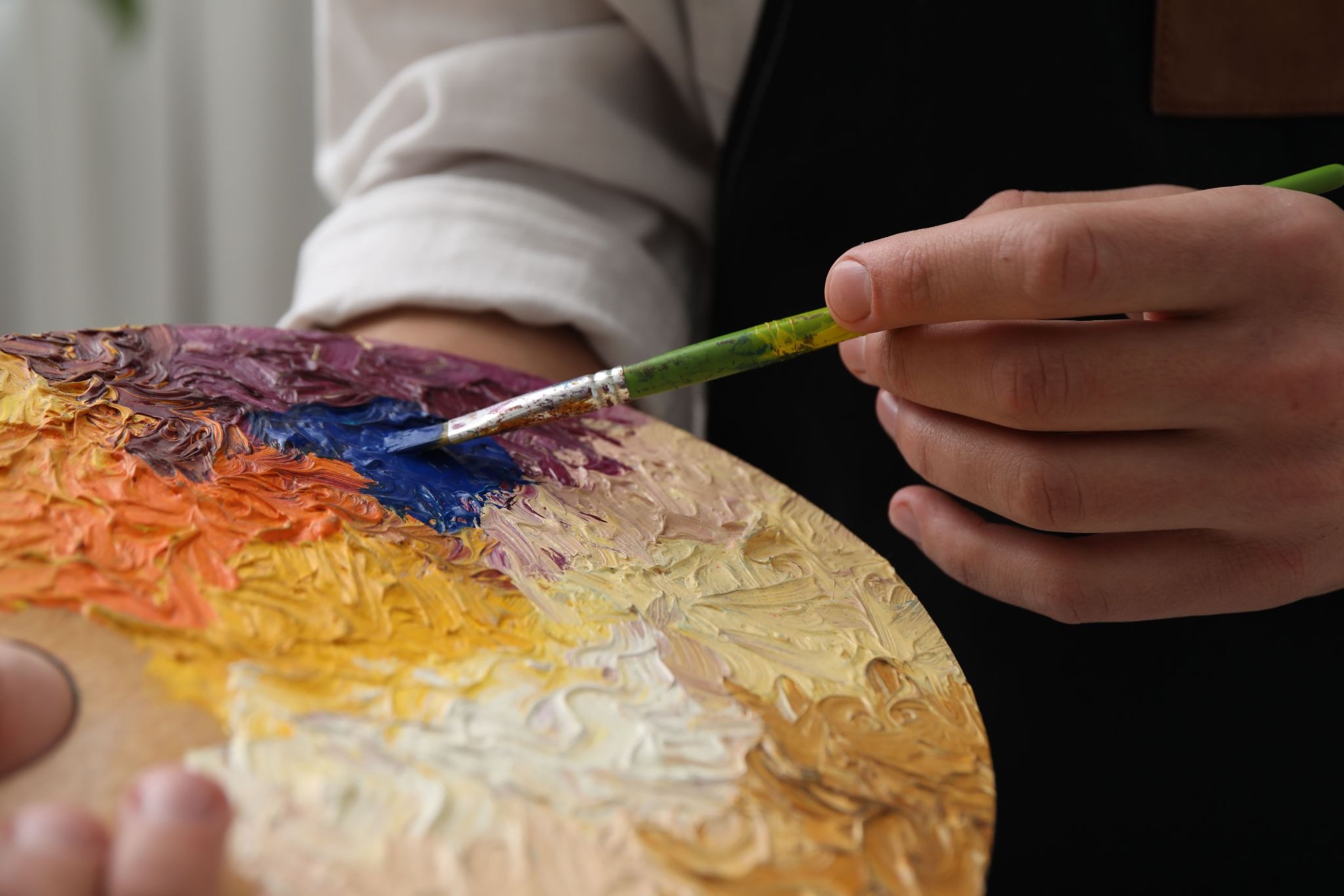
One of the best ways to solve a digital problem is to step away from the computer entirely. We often get stuck in the limitations of our software, thinking only in terms of what the tools allow us to do easily. By working with your hands using analog methods clay, paper, paint, or photography you bypass those limitations and tap into a different part of your brain.
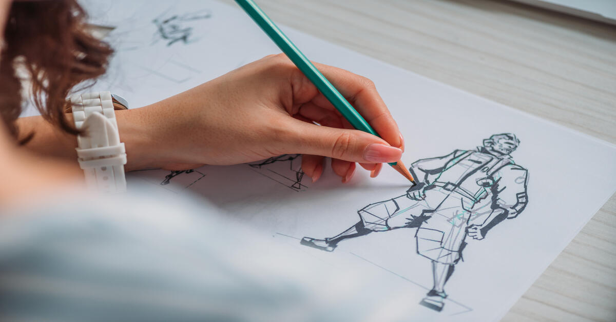
Sketching with a pencil and paper is the fastest way to iterate on an idea. When you work in software, you often get distracted by pixel-perfect alignment and color choices too early in the process. A rough sketch forces you to focus purely on the concept and the composition. It allows you to make “bad” drawings quickly, which helps you get the bad ideas out of your system so the good ones can flow.
Another powerful technique is creating physical mood boards or collages. Take old magazines, ticket stubs, fabric swatches, and photographs, and physically paste them together. This tactile approach allows you to see texture combinations and juxtapositions that an algorithm would never suggest to you.
When you physically layer a piece of torn cardboard over a glossy photo, you create a contrast that is hard to simulate but easy to see. You can then photograph or scan these collages to use as assets in your digital work. This results in visuals that look completely unique because they were generated in the real world, not selected from a stock photo library. It gives your project a bespoke, handcrafted quality that stands out.
It sounds counterintuitive, but sometimes the enemy of creativity is too much freedom. When you can do anything, you often end up doing nothing because the possibilities are paralyzing. To snap out of a creative block, try imposing strict constraints on yourself. These artificial boundaries force your brain to work harder to find a solution.
Try the “One-Font Challenge,” where you have to design an entire poster or landing page using only one font family, relying solely on weight and size to create hierarchy. Or try the “Monochromatic Limit,” where you remove all color choices and design in black and white. This forces you to focus entirely on layout, spacing, and contrast. By removing the easy options, you push yourself to discover creative workarounds that you would have never found if you had unlimited tools.
The journey from a blank canvas to a finished masterpiece is rarely a straight line. It is a winding path that requires you to look outside of your immediate surroundings for guidance. Whether you are studying the veins of a leaf, analyzing a vintage poster, or getting your hands dirty with charcoal and paper, the goal is the same: to find a new perspective. Design inspiration is not something that just happens to you; it is something you have to actively pursue.
The world is full of visual data waiting to be processed and remixed into something new. By diversifying your sources looking at nature, history, print, and analog art you ensure that your work remains fresh and distinct.